On Composition
Composition is something photographers work hard to master. But it remains a lifelong quest for most of us. Even though the principals of composition will guide you in capturing an pleasing image, it’s your own aesthetics that are the final judge. Because for any rule of composition there thousands of successful images that break the rule.
It’s your job as a photographer to put to create an image that combines both the visual and emotional elements of the scene in front of you with your camera’s objectivity. You can start is process by taking moment to evaluate all the elements in the scene before you, gradually narrowing your view looking for scenes within scenes. Do this by paying attention to, and thinking about organizing, the dominant elements, patterns, textures, and color into a pleasing image.
Before you release the shutter consider why you’re making this image and what do you intend to convey to the viewer?
Without considering these questions you risk creating an image lacking a clear message. Refining your image to a single idea is the most important thing in composing a well made image.
Once you know what your image is to convey use these guidelines of composition to refine your image.
Symmetrical vs. Asymmetrical Compositions

In a symmetrical image the composition is balanced top-to-bottom and side-to-side. Creating a scene of stability, and is usually boring visually. That’s because our eyes search for symmetry. When we see symmetry we loose interest in the image and our eyes are ready to move on.
Creating Balance
Balance is the feeling of rightness an image coveys. A balanced image doesn’t look lopsided or too off center. Balance is created by evaluating, and positioning, these elements in the frame in a way that is pleasing to the eye (weight, objects, & placement):
- The visual “weight” of color and tone, dark is heavier than light.
- Large “objects” appear heavier than small ones.
- “Placement“, objects placed near an edge of the frame appear heavier than those nearer the center
Lines
Lines have symbolic meaning. They can be used to direct the viewer’s focus, help organize the visual elements, and to support communications. A classic example is a winding stream that leads the viewer’s eye into a landscape.
Traditional, lines symbolize these meanings
- Horizontal lines – stability, tranquility, peacefulness.
- Vertical lines – motion and strength.
- Diagonal lines – dynamic tension and strength.
- Curved lines – grace.
- Wavy lines – peaceful movement.
- Zigzag lines – action
- Jagged lines – tension
Fill the Frame
Fill the frame with elements that support your message. Just like a painter fills their canvas and only paints elements that support their message. The answers to the questions asked earlier will help determine how much of the scene to include in your image. Every element you include ought to reveal or support your subject.
Check Your Background, Remove Clutter
This is related to the last section, “Filling the Frame “, but deserves it’s own discussion.
The elements behind or around the subject of any image are as much a part of the image as the subject. While you’re composing you photograph, look at all at areas of the viewfinder for objects that compete with, or appear to distract from, or merge with, your subject.
The classic example is a branch growing out of someone’s head!
Try moving your subject or yourself to get a different point if view.
Using the Rule of Thirds
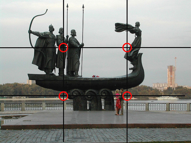
This is a standard technique of composition. You can this used in the classical paintings of the great artist too. Imagine dividing the your image in three vertically and horizontally like a hashtag (#). This creates four intersection of lines in you viewfinder (top left, top right, bottom left, and bottom right). Interesting compositions often have the subject placed at one of these points, or along one of the lines.
For a portrait consider placing your subjects eyes at one of the upper intersections. For landscape, or seascape, images try putting the horizon on one of the horizontal lines. Horizon alignment with the lower line emphasizes the sky while placing the horizon along the upper line will emphasize the foreground.
Tips for using the Rule of Thirds
- If you subject is a static spot place it at one of the intersections of lines.
- Place horizontal subjects along one of the horizontal lines.
- Use the vertical lines for vertical subjects.
- Considering using both a line and an intersection for vertical and horizontal subjects.
- Consider placing a standing person on a vertical line so that their eyes fall on an intersection.
Composing With Color
Color can be used to create a sense of balance and harmony, or alternatively, it can make visually stimulating and bold statements.
When using color as an element of composition remember complimentary colors are those that are opposite on the color wheel such as green and red or yellow and blue. While harmonizing colors are next to each other like yellow and green or orange and yellow.
Tips for composing with color
- Use complimentary colors of around the same intensity to create an image that pops visually.
- Use harmonizing colors to create peace and tranquility.
- The greater an object contrasts with it’s surroundings the more attention it will get from the viewer.
- The the fewer color differences throughout the scene the more the mood will be dictated by the overall color (think green field, mountain lake, or an overcast seascape).
- Light intensity affects color intensity. Fog, haze, and mist diffuse the light creating conditions for harmonizing colors. But a bright sunny day creates conditions for images with striking and bold color contrasts.
Frame the Subject
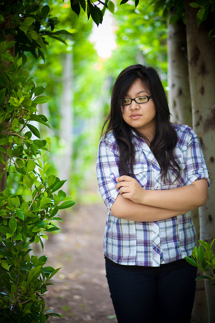
Framing the subject is also known as creating a frame within a frame. It’s a technique taken from painters. Place your subject in a naturally occurring frame within your scene like a door or window frame. Trees, branches, and shrubs also make good frames. Frames are best used when they add context or visual interest to your subject.
Focus and Depth of Field
Your viewer’s eyes will be drawn to the sharpest part of your image first. So make sure your subject is the object with the sharpest focus.
The address of the scene, foreground to background, that is in acceptably sharp focus is called the “the depth of field”. The depth of field is controlled through a combination of focal length, aperture, and distance to the subject.

- Longer focal length (200mm) and larger aperture compress depth of field (f/2.5).
- Shorter focal length (50mm) and narrower aperture increases depth of field (f/16).
- Moving closer to your subject decreases depth of field, moving away increases it.
Point of View, a.k.a., Perspective
Don’t just shoot from eye level. Try various view points for different effects. For example, photographing a person from below their eye level will make them seem more dominant and powerful.
Capturing images of a scene from many points of view is called “working the scene “. This also includes changing the way you frame a scene, vertically or horizontally, and even diagonally some times!
Tone and Contrast
Contrast is the difference between light and dark and can be used to make your subject stand out. A small white subject will stand out against a dark wall than it would against a brightly lit and lightly colored wall. And red is almost always is the first color your viewer will see!
Leading Lines

Lines that occur naturally in your scene can be used to lead the viewer through your image, typically from the foreground to the background or main subject. This technique is used very often by landscape photographers such as the use of railroad tracks or a stream heading off into the distance.
Leading lines are useful in portraits too. Try positioning your subjects hands and arms in a way that leads the viewer’s eyes to your subjects face.
Summary
Here is what Henri Cartier-Bresson had to say on composition:
“Composition must be one of our constant preoccupations, but at the moment of shooting it can stem only from our intuition, for we are out to capture the fugitive moment, and all the interrelationships involved are on the move. In applying the Golden Rule, the only pair of compasses at the photographer’s disposal is his own pair of eyes.” – (From “The Minds Eye “, Aperture Publishing
)
Photo Credits
“Symmetry” by Julien Belli
“Leading Lines” by Frank Kovalchek
“Depth of Field” by Ben Seidelman
“Framing” by Sodanie Chea
“Rule of Thirds” by Michael Miller
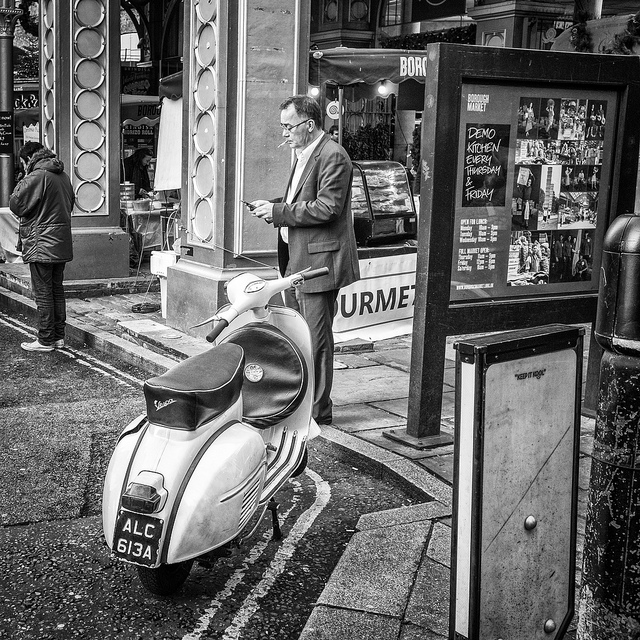
“Vespa” by Thomas Thorstensson